Airbnb Design Evolution
Hi! Welcome to my 1st blog about UX Design. Today, I am learning how Airbnb evolving its company from UX Timeline
Airbnb began in 2007 when two designers who had space to share hosted three travelers looking for a place to stay. Now, millions of hosts and travelers choose to create a free Airbnb account so they can list their space and book unique accommodations anywhere in the world. And Airbnb experience hosts share their passions and interests with both travelers and locals. - Airbnb
I have been using Airbnb since 2013, when their logo was blue & white, because my family is an Airbnb host, and I need to learn how to communicate with the guests to make sure that they have a nice holiday.
What are some noticeable changes throughout the years?
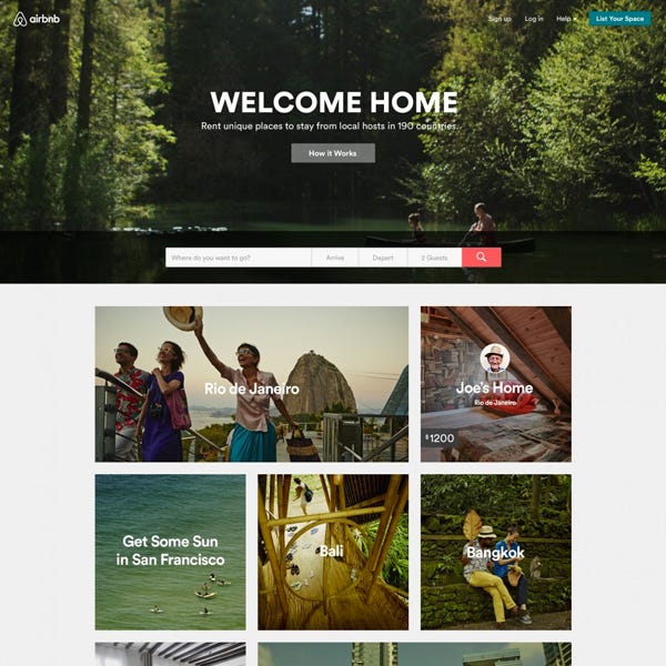
Their logos. From blue and pink (2007-2009) to blue and white (2010-2013), and finally red (2014-Present). And their slogans too!
Their website became minimalistic and featured artistic/aesthetic illustrations from 2016. Less is more 😌
Their search box 🔍 They were modifying the search boxes literally every year.
Why these changes were made?
There are millions of Airbnb users around the world 🌏📈 It is important that their website is regularly updated in order to provide the best user experience.
Let’s read their timeline here 👇 I highlighted more noticeable changes below.
2007
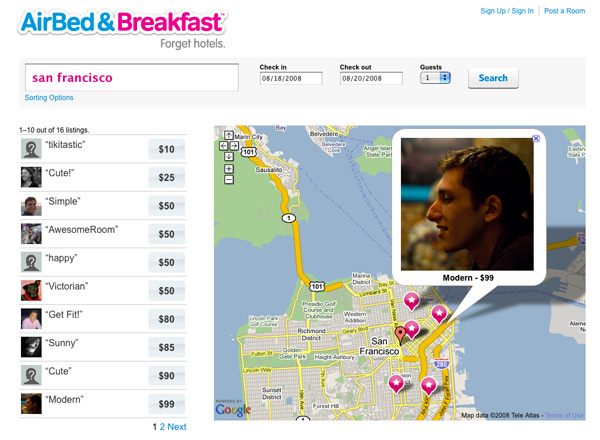
Airbnb was known as Airbed & Breakfast. Users can discover a place to stay by searching for an event, city, and when it is taking place.
I had no idea their 1st logo was blue and pink, which is similar to an ice cream brand. With the slogan "A friend, not a front desk." However, hotels and resorts are now posting their accommodations on Airbnb as well.
2008
Airbed & Breakfast launched a new slogan, "Forget hotels." Users can find a place to stay by entering the number of guests, check-in, and check-out dates.
2009
Airbed & Breakfast was renamed as AirBnB, with the slogan "A new way to travel." Introducing the fact that they have locations in 750 cities across 72 countries, with photos of destinations all throughout the world.
Post a Room button became a primary button. The search function has been redesigned.
There were room details, host details, images, a map, street view, and a calendar on the listing page. Before booking, the guest can book or contact the host.
2010
Airbnb mobile app is released. The logo is changed to blue, with a script font and a new motto, "Travel like a human."
The Sign Up/Sign In buttons are located a little further away from the Post a room button. I think this would help a user avoid making a mistake by clicking on the wrong button.
The total number of cities has risen to 1492. Images of cities were visible, along with an average nightly price.
There were social proof and trust icons from various news agencies 📰
Users can access information about, blog, help, Airbnb contact, terms & privacy, destination suggestion, Airbnb social media, and change the language in the footer.
They introduced groups, for example, if a user is interested in wine, they can join the group or book a stay of a host who is also a wine lover! 🍷
2011
People can apply for a job at an Airbnb company, learn how it works, and change the currency in the header. The number of cities grew to 10,701 and the number of countries increased to 178.
Instead of photos of cities, Airbnb featured images of their company.
The description, amenities, house rules, number of reviews, host information, and similar listings can all be viewed by the user.
2012
Airbnb began greeting users by their first name. Hello, (name)! which is a type of personalization ❤️
The user can check their inbox, wishlists, support, and safety, as well as change their language and currency. The number of cities increased to 30,743 and the number of countries increased to 192. The search tool has been updated 🔍
The accommodation results were displayed alongside a little map.
2013
There were 2 search boxes. 1 was located just below the header, and another was in the center with an image of a host's place. The language and currency settings have been relocated to the footer.
There are over 34,000 cities. Introducing neighborhood guides and host community.
The accommodation results were displayed alongside a bigger map 🗺 When viewing a map, the user can change the language and currency at any time.
2014
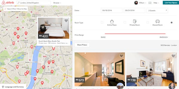
Airbnb changed its logo to Red and used a sans serif typeface.
Airbnb began to use more icons, such as when selecting room types. Less written language and more visuals 🏞
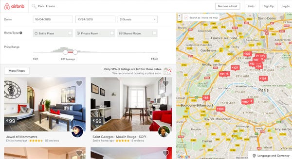
2015
Changing location pins to the price of that location so that users may more easily search for their place at the price they are interested in 📌
2016
Text fields in the search box have form labels, which is useful because some users may forget why they are filling out this box.
Airbnb Experiences launched.
2017
The order has been rearranged, and the results are shorter than in 2016
2018-2019
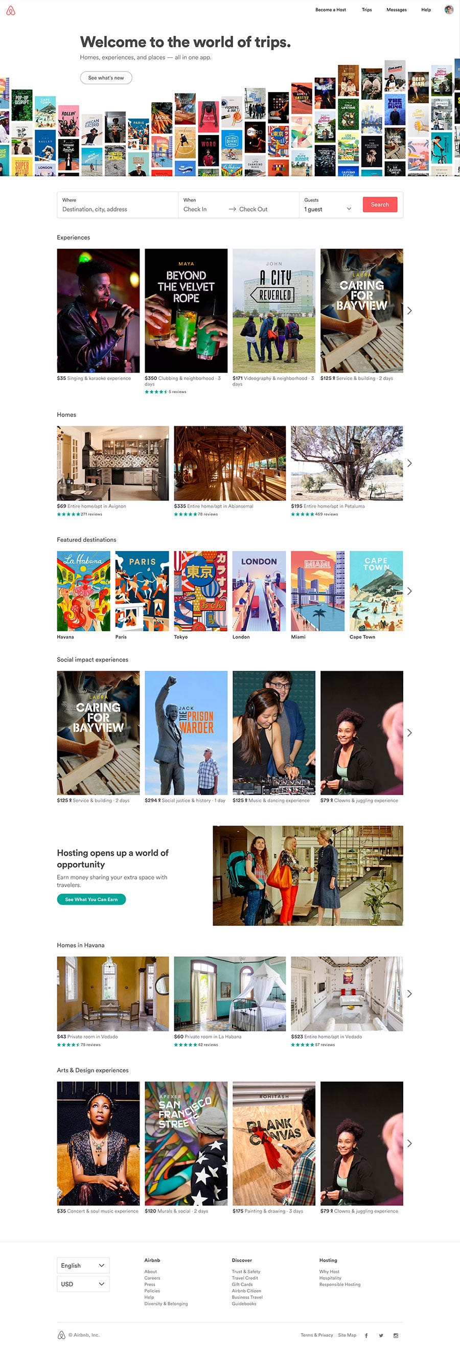
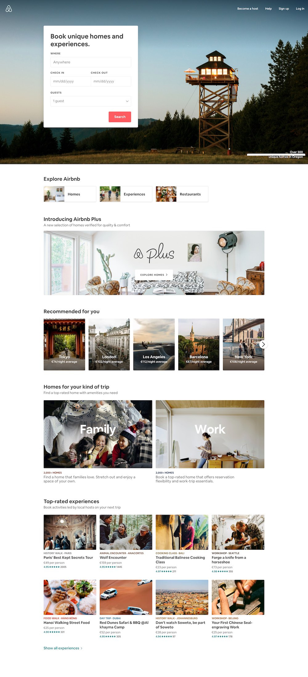
The search function was displayed a box. Airbnb recommended destinations or types of homes to the user.
Airbnb Plus is now available.
2020
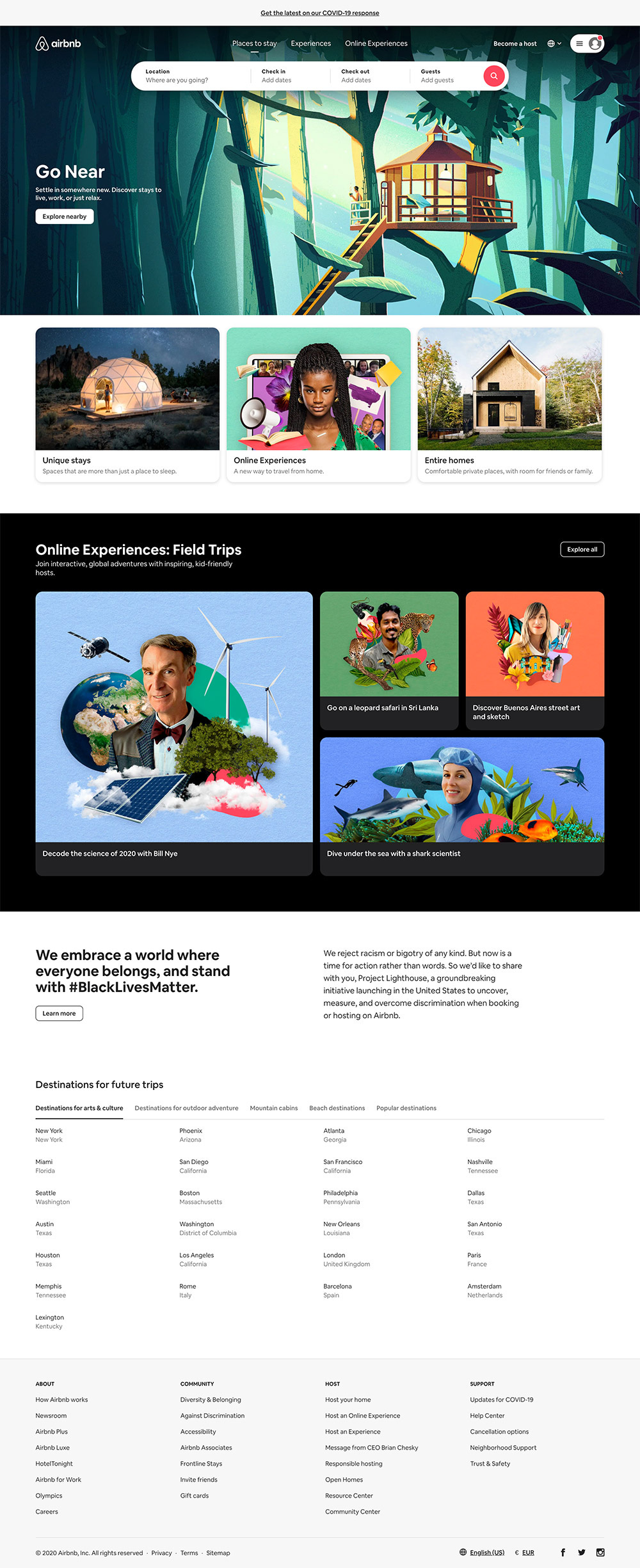
Airbnb's search box was once again horizontal across a website. Component corners are rounded. Destination suggestions for future vacations. The header allowed users to switch languages.
Introducing Online Experiences and Airbnb highlighted it with the high contrast background. Airbnb supports the #BlackLivesMatter movement.
2021
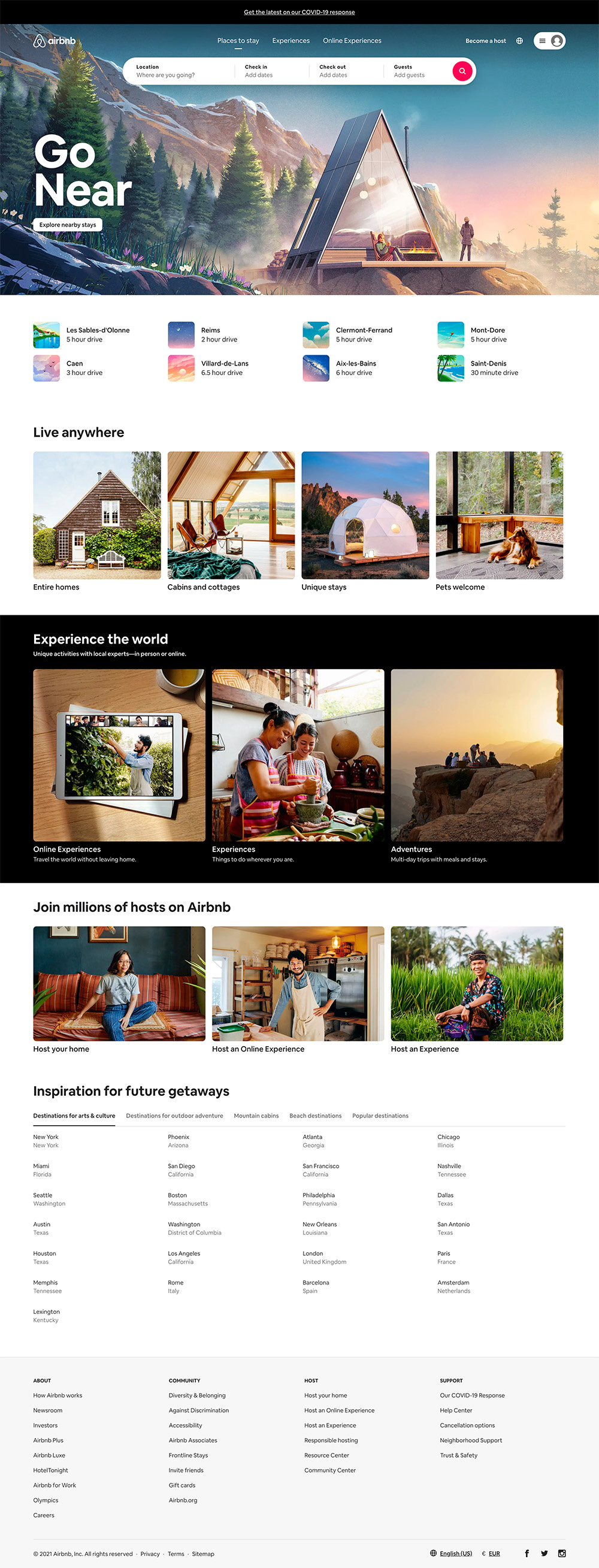
Personalization of location, recommending nearby cities, and indicating how long it will take to drive there 🚗
Some of the Heuristic Evaluation that Airbnb applied based on these timelines
- Heuristic #4 Consistency and Standards
Users are not constantly required to learn new functions. Sign Up/Sign In and Become a Host (or List Your Place) is always at the top right of the header on Airbnb. Their search bar is usually located on the upper left of the header as well.
- Heuristic #8 Aesthetics and Minimalist Design
Airbnb has made it easier for users to use search boxes in recent years by changing the contrast between search boxes and backgrounds.
As an Airbnb user for many years, I can confirm that Airbnb has the other 8 Heuristics which I might write about them in the future.
Useful Resources 🔗
You can view full photos of Airbnb timelines on UX Timeline
Check out Airbnb Design if you want to know more about their design!
If you want to learn more about Airbnb slogan evolution, please check All About Airbnb
Learn more about Heuristic Evaluation at Nielsen Norman Group
Please wishlist/bookmark my family’s Airbnb at Krabi, Thailand 🌴
Hope to see you someday! :)


